Filters
Tattoo Ideas
3D Virtual Try-On
Stop guessing. See exactly how your tattoo will look on your body. Upload your design, and visualize it instantly.
- Realistic 3D skin simulation
- Multiple body positions
- Upload your own design
Redefining Masculine Ink: The Watercolor Aesthetic
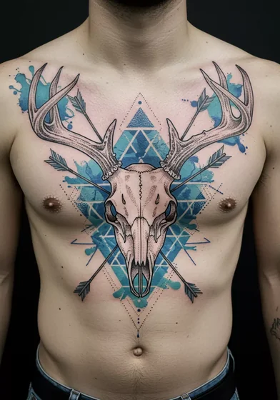
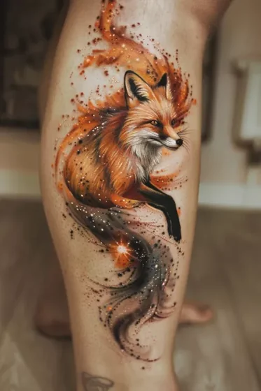
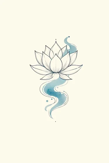
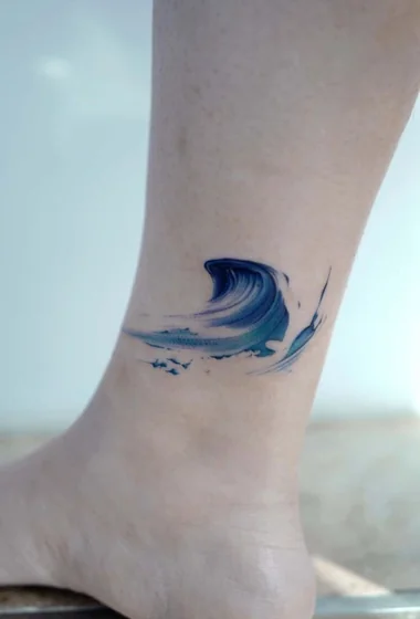
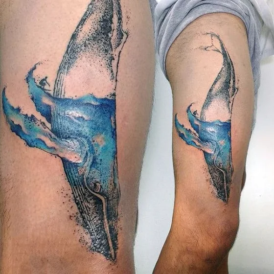
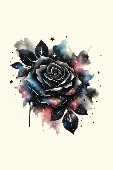
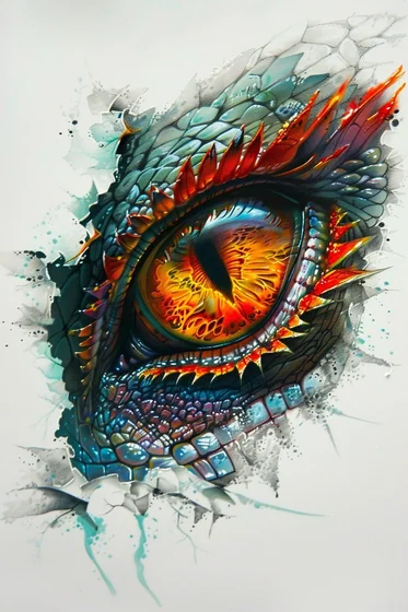
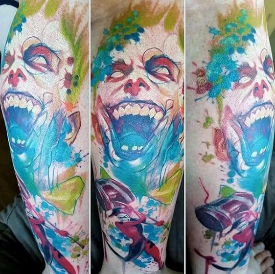
Watercolor tattoos for men represent a sophisticated fusion of fine art and masculine resilience, characterized by bold saturation, deliberate chaos, and the absence of rigid outlines. Unlike the misconception that painterly styles lack edge, modern techniques integrate "trash polka" elements and heavy blackwork to ground the fluid colors, creating a dynamic visual tension suitable for masculine aesthetics. This style amplifies imagery rather than softening it—turning a standard lion portrait into a kinetic display of raw energy.
Quick Fact Sheet: Watercolor Tech Specs
| Feature | Details |
|---|---|
| Pain Scale | 4/10 (Standard), 7/10 (Ribs/Spine due to shading) |
| Healing Time | 2-3 Weeks (Surface), 3-4 Months (Deep tissue) |
| Cost Estimate | $$$ (Requires specialized color blending expertise) |
| Best Placement | Forearm, Calf, Upper Chest (Low friction areas) |
1. High-Impact Subjects & Anatomical Flow
To ensure the design commands respect, the imagery must interact with your body's natural lines.
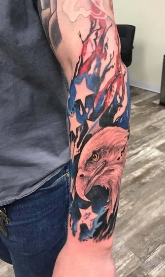
- Geometric Fauna (Wolf, Bear, Eagle): Combine sharp geometric lines with fluid color bleeds. Anatomical Integration: Align the animal's gaze or movement with the deltoid or bicep muscle separation to create a 3D effect when you flex.
- The "Dark" Butterfly: The watercolor butterfly tattoo is experiencing a renaissance among men. By using dark wing bases (charcoal/navy) that transition into vibrant tips, it symbolizes resilience and metamorphosis.
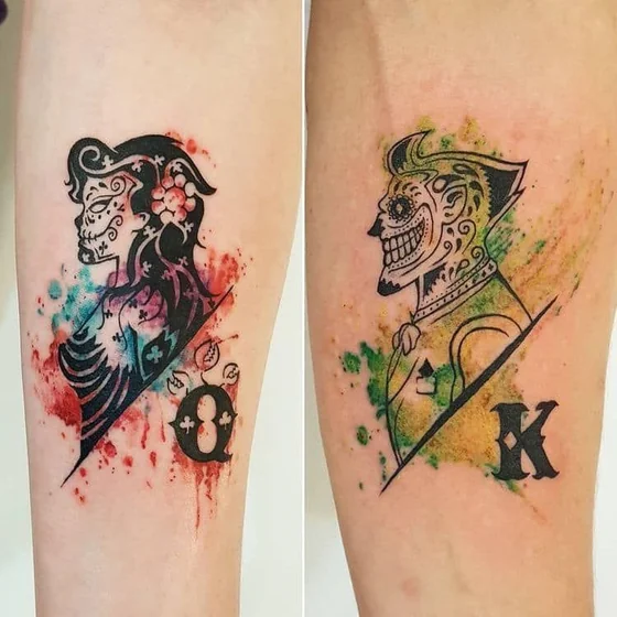
- Mythological & Skulls: Norse gods or skulls gain atmospheric depth when surrounded by smoky grays and electric accents (crimson, cobalt).
Expert Reality Check: Watercolor tattoos lack the "black dam" of traditional outlines. Physical Limitation: Without a black skeleton, colors can spread over time. Ensure your artist uses high-contrast black anchors to prevent the design from becoming an amorphous blob after 5+ years.
2. Color Intensity & Longevity Strategies
Your career and lifestyle dictate the color palette. Choose a strategy that fits your long-term goals.
- Dark Palette Base: Navy, deep green, and burgundy foundations.
- Best for: Corporate professionals.
- Advantage: Ages like a traditional bruise-style shading; very discreet.
- Vibrant Contrast: Primary colors (gold, cyan, magenta) against black ink.
- Best for: Creative industries.
- Maintenance: Requires SPF 50+ daily; UV rays destroy yellow/orange pigments rapidly.
- Monochrome Watercolor: Black and gray wash with splash effects.
- Best for: Minimalists.
- Advantage: Lowest maintenance; zero color fading risk.
For a different perspective on color theory, compare this with designs for women, which often prioritize pastel gradients over high-contrast saturation.
Explore More Styles
Masculine Classics
- Wolf Tattoos: The perfect subject to combine with watercolor splashes for a wild, untamed look.
- Lion Tattoos: Use royal reds and golds in a watercolor style to emphasize leadership.
- Skull Tattoos: Add an artistic edge to mortality symbols with abstract color bleeds.
Structural & Placement
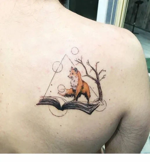
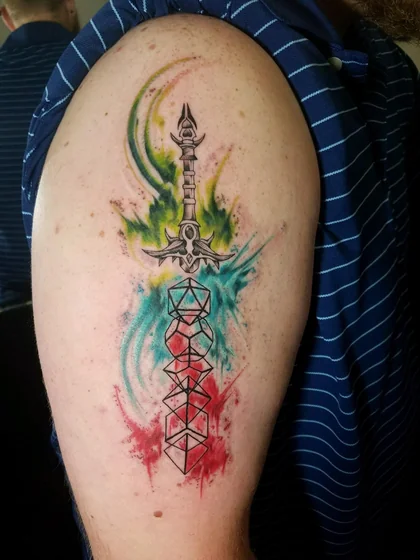
- Geometric Tattoos: The rigid lines provide the necessary "container" for fluid watercolor ink.
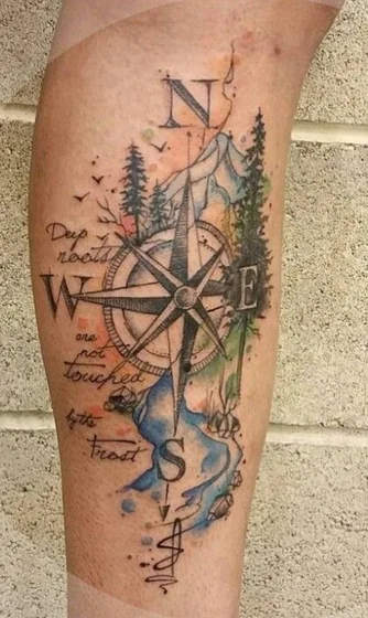
- Chest Tattoos: A broad canvas ideal for expansive watercolor landscapes.
Planning Tools
- Tattoo 3D Tryon: Eliminate placement uncertainty by virtually testing watercolor designs on your own skin.
- AI Design Agent: Generate unique watercolor concepts tailored to your muscle structure.
- Tattoo Ideas Collection: Browse the full library of ink inspiration.