Filters
Tattoo Ideas
3D Virtual Try-On
Stop guessing. See exactly how your tattoo will look on your body. Upload your design, and visualize it instantly.
- Realistic 3D skin simulation
- Multiple body positions
- Upload your own design
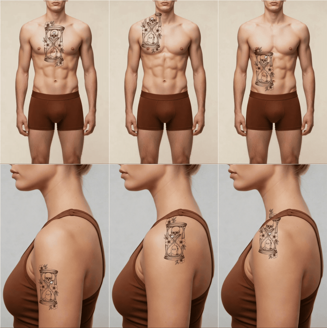
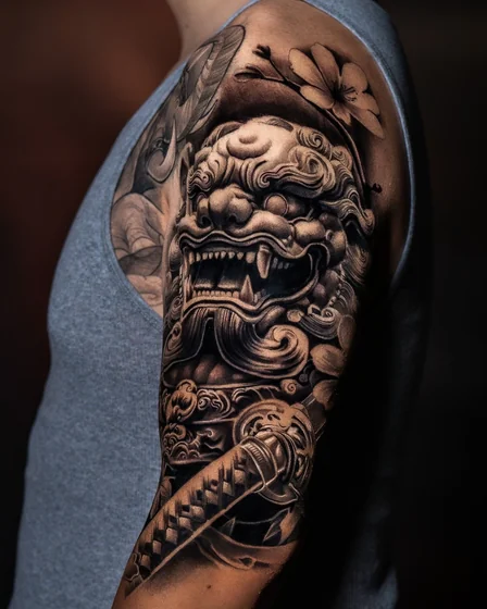
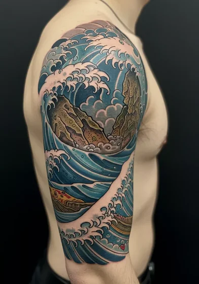
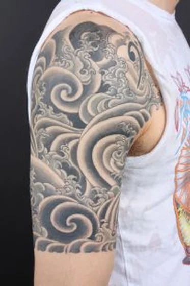
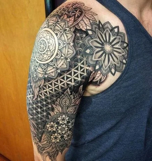
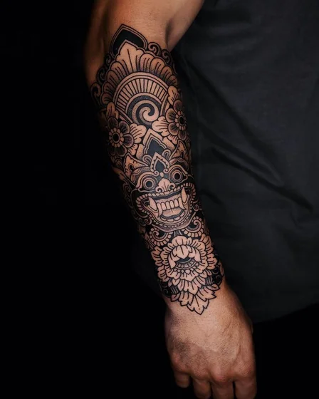
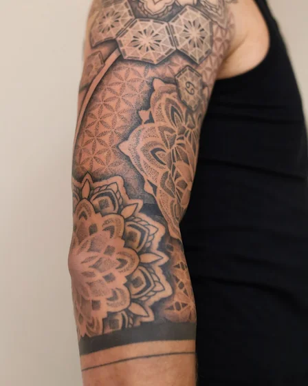
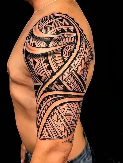
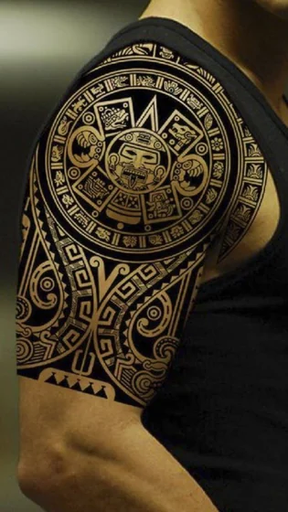
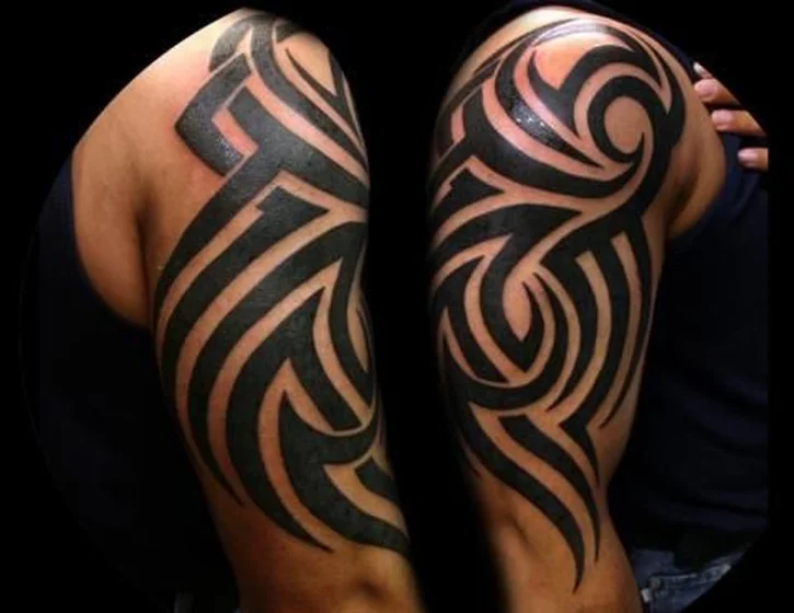
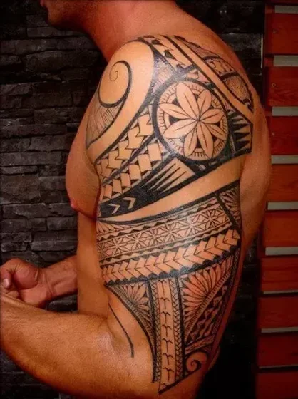
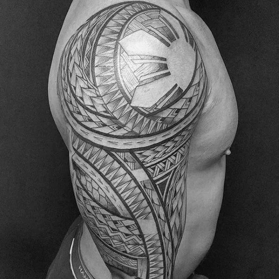
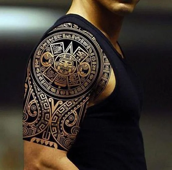
Half sleeve tattoos for men represent the ideal balance between professional concealment and physical assertion, covering the area from the shoulder cap to the elbow. These designs utilize the natural curvature of the deltoid and bicep to enhance muscular definition, offering a substantial canvas for detailed storytelling without the full commitment of a full sleeve.
Half Sleeve Tattoo: Quick Fact Sheet
| Feature | Specification |
|---|---|
| Placement | Shoulder Cap to Elbow (Outer & Inner) |
| Pain Scale | 4/10 (Outer Arm) to 7/10 (Inner Bicep) |
| Healing Time | 2-3 Weeks (Surface), 3-4 Months (Deep) |
| Cost Estimate | $150 - $250 per hour (Total: $1,200 - $3,000+) |
Selecting Patterns That Enhance Masculine Physique
Your pattern choice should work synergistically with muscle structure rather than fighting against it. Athletic builds gain the most traction from designs that track specific muscle groups to create visual power.
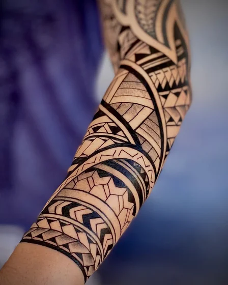
- Tribal & Geometric: Bands should follow the natural taper from shoulder to elbow, emphasizing arm definition during flexing.
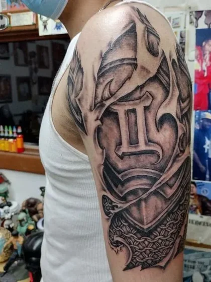
- Biomechanical Motifs: Designs wrapping around the bicep create dimension—gears and pistons appear to move beneath the skin when you lift or rotate your arm.
- Japanese Backgrounds: Kumadori (cloud backgrounds) fill negative space while maintaining masculine energy through bold, consistent line work.
- Focal Point Placement: Position primary elements—like skulls or predator faces—on the outer bicep for visibility during handshakes. Extend secondary elements (smoke, waves) vertically down the forearm to avoid shortening the visual length of the arm.
Pattern Density and Professional Context
Selecting the right density is crucial for balancing aesthetic impact with career requirements.
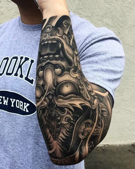
- Heavy Blackwork (60-80% Coverage):
- Visual Impact: Maximum contrast and masculinity.
- Professional Context: Difficult to conceal; best for trades, creative industries, or entrepreneurship.
- Detailed Illustrative (40-60% Coverage):
- Visual Impact: Realistic imagery with depth and shading.
- Professional Context: Easier to frame as "art appreciation" in business casual environments.
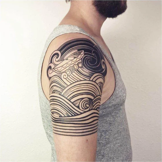
- Minimal Line Patterns (20-40% Coverage):
- Visual Impact: Geometric or single-needle work with maximum negative space.
- Professional Context: Most versatile for corporate roles (Finance/Law)—reads as refined rather than rebellious.
Sizing for Muscle Growth and Maintenance
If you are actively training, communicate your lifting goals to your artist. A design placed on a rapidly growing muscle group can stretch and distort—a tight portrait at 160 pounds becomes elongated at 190 pounds.
- Expansion Tolerance: Request organic shapes like smoke, water, or flora. These adapt better to hypertrophy (muscle growth) than rigid mechanical patterns or precise lettering.
- Definition vs. Detail: Lean builds showcase fine detail work beautifully. Bulkier physiques require bolder elements with thicker lines, as intricate crosshatching can disappear in the shadowed valleys between large muscle bellies.
- Vascularity Warning: Competitive bodybuilders should avoid inner elbow and inner forearm work, as extreme vascularity during competition causes visual distraction from the design itself.
Session Strategy and Gym Schedule Coordination
Most masculine half sleeve designs require 10-15 hours of needle time, typically split across 2-4 sessions.
- The Blueprint: Schedule outline work first to establish the framework and test pain tolerance.
- The Gap: Book your second session 3-4 weeks out. This allows full surface healing and gives you time to assess if the composition needs flow adjustments.
- Training Downtime: Halt upper body workouts for at least two weeks post-session. Blood flow from "pumped" muscles pushes ink out of fresh wounds, leading to patchy healing.
- Cardio Rules: Light cardio is acceptable after day three, provided you wipe down equipment thoroughly and rewrap the tattoo before leaving the gym.
See how feminine approaches prioritize different composition values for contrast in design philosophy.
Explore More Styles
Structured & Technical
- Geometric Tattoos: Precision lines that enhance the natural flow of musculature.
- Biomechanical Tattoos: Industrial aesthetics that turn anatomy into machinery.
- Compass Tattoos: Navigational symbols perfect for the outer bicep focal point.
Bold & Traditional
- Japanese Tattoos: Traditional Irezumi style that maximizes coverage and flow.
- Skull Tattoos: High-contrast memento mori themes ideal for heavy blackwork.
